Pinterest 2025 color palette is here, and at Nuance Digital Dynamics, we’re excited to see how these fresh, expressive shades can transform web design in meaningful and trend-forward ways. As a company that lives at the intersection of digital creativity and strategic functionality, we love when a new color forecast sparks innovation in how brands present themselves online.
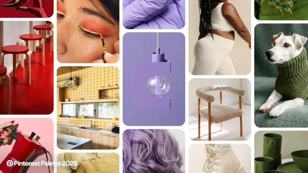
In this blog, we’re walking you through Pinterest’s carefully curated color palette for 2025—complete with color codes and web design applications. Whether you’re planning a rebrand, launching a new product, or simply looking to modernize your aesthetic, the Pinterest 2025 color palette offers a spectrum of opportunity.
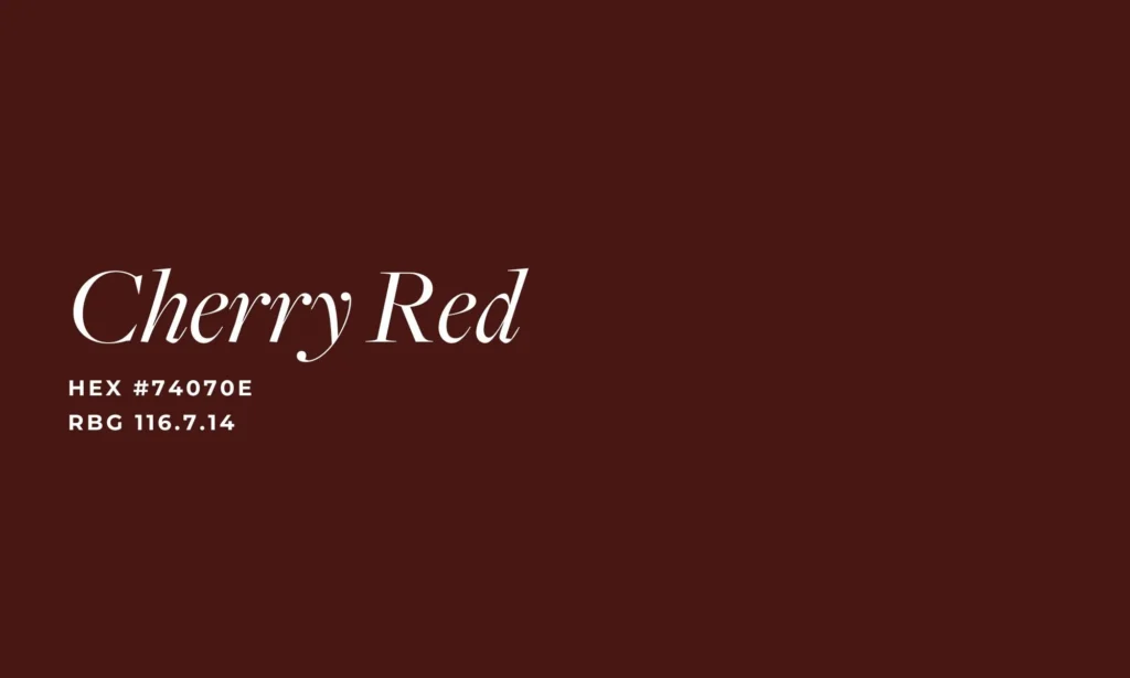
Cherry Red: Bold, Sophisticated, and Commanding
Cherry Red is a standout shade in the Pinterest 2025 color palette—a vibrant, deep red that instantly commands attention. We recommend using this color strategically to highlight high-priority content or actions.

How to Use It:
- Buttons and Calls-to-Action (CTAs)
- Header text or section dividers
- Promotional banners or sale notifications
Example: For a fashion eCommerce brand, we recently applied Cherry Red to their ‘Add to Cart’ buttons and flash sale headers. The result? A 17% increase in CTA clicks within the first 30 days of deployment.
Cherry Red has the power to evoke emotion and urgency without overwhelming your site. Pair it with neutrals or earth tones to ground its energy and keep it elegant.
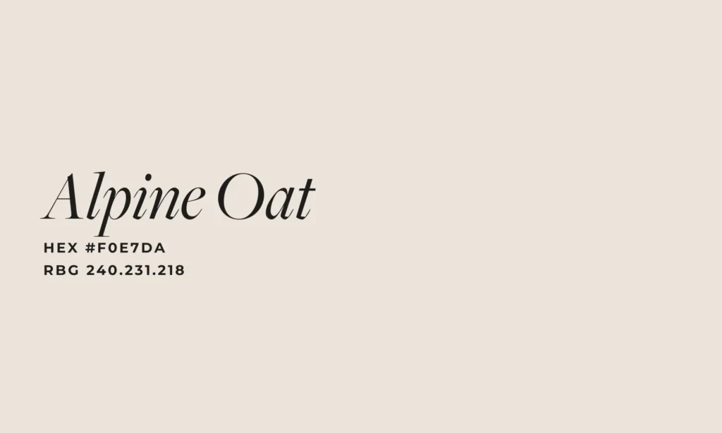
Alpine Oat: The Calm, Versatile Neutral
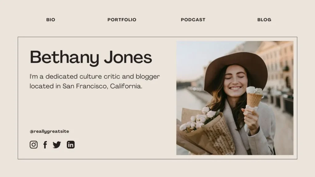
Next in the Pinterest 2025 color palette is Alpine Oat, a warm neutral that offers subtlety and polish. It’s ideal for wellness, health, and lifestyle websites where a soothing visual experience is paramount.
How to Use It:
- Global background color
- Section containers or overlays
- Typography highlights on textured backgrounds
Example: For a health and nutrition coach, we used Alpine Oat as the foundation of her homepage, pairing it with rich imagery and clean font choices. This allowed the content to breathe and subtly emphasized her brand’s holistic values.
Alpine Oat is perfect when you want your design to feel grounded, spacious, and accessible.

Dill Green: Nature-Inspired, Rooted in Trust
Dill Green brings an earthy richness to the Pinterest 2025 color palette, echoing tones found in natural landscapes and sustainable brands.

How to Use It:
- Navigation bar background
- Accent elements in testimonials or blog sections
- Custom icons or infographics
Example: For a pet rescue organization in Colorado, we created a nature-driven theme using Dill Green as the primary color. It brought warmth, trust, and a strong connection to their mountainous environment—making the digital space feel tangible and heartfelt.
This tone is perfect for eco-conscious brands, wellness businesses, and any organization looking to communicate authenticity and care.
Aura Indigo: Nostalgic, Creative, and Unique
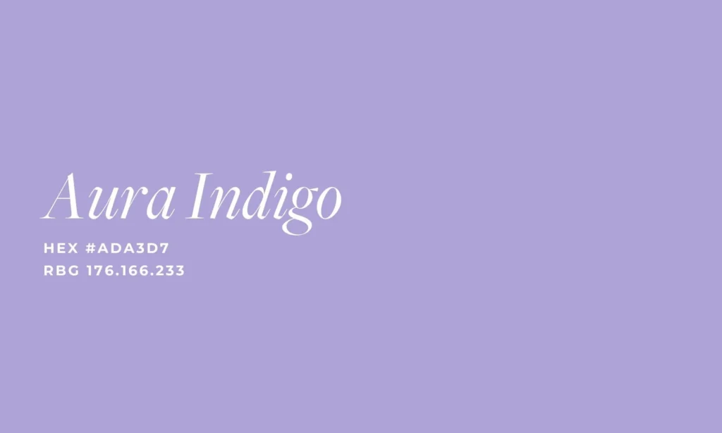
Aura Indigo is the artistic rebel in the Pinterest 2025 color palette. A pastel purple that feels both nostalgic and modern, it creates a visual signature that’s hard to forget.

How to Use It:
- Hero sections for creative industries
- Background color in pop-up modals
- Testimonials or story sections to evoke emotion
Example: For a beauty product website, we applied Aura Indigo to product headers and promotional carousels. The soft purple felt like an invitation to explore, helping users connect emotionally with the brand’s message of self-expression and color positivity.
Aura Indigo is great for anyone targeting Gen Z or Millennial audiences—it evokes digital nostalgia with a modern edge.
Butter Yellow: Gentle, Balanced Brightness
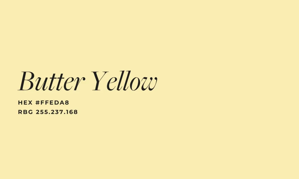
Butter Yellow rounds out the Pinterest 2025 color palette with a soft, sunlit hue. It’s bright, but not brash—making it ideal for uplifting accents.
How to Use It:
- Highlight buttons for special offers
- Seasonal theme variations
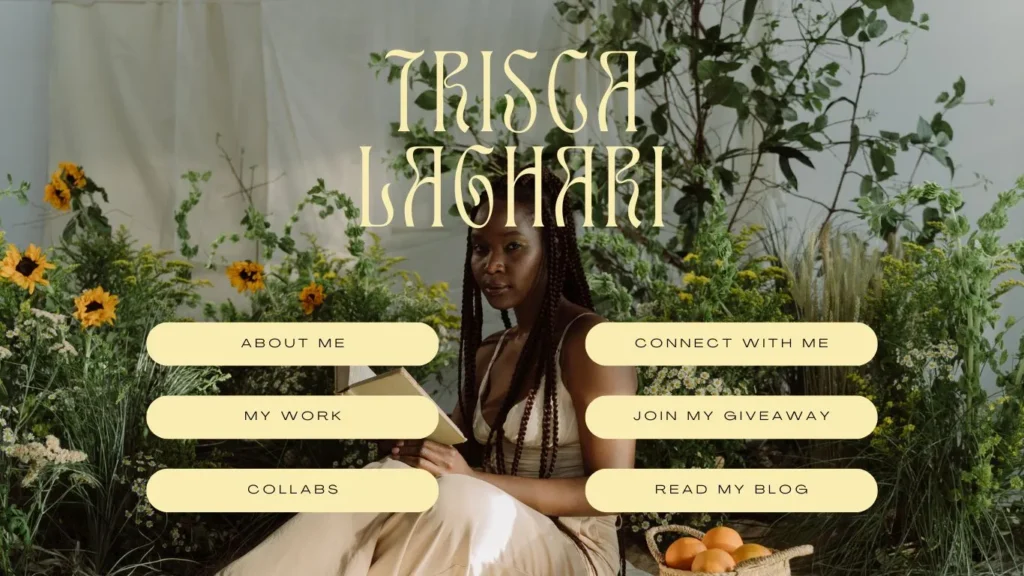
- Text overlays on darker image backgrounds
Example: In a website for a local plant shop, we used Butter Yellow sparingly in button hovers and secondary headers. To prevent the color from overwhelming the viewer, we balanced it with leafy background images and soft greens. The contrast was subtle yet delightful.
Butter Yellow brings joy, but it works best when used with restraint. Think of it as a highlight pen, not a paint roller.
How to Combine the Colors for Maximum Impact
While each shade in the Pinterest 2025 color palette can stand on its own, combining them wisely can elevate your design even further. Here are a few tips:
- Alpine Oat + Cherry Red: Use the neutral base to let the bold red shine on CTAs.
- Dill Green + Butter Yellow: Combine these for a natural yet fresh vibe—perfect for spring collections or eco campaigns.
- Aura Indigo + Alpine Oat: Create contrast between modern nostalgia and calm neutrality to tell a layered story.
These combinations offer variety while maintaining visual balance—exactly what you want in a well-designed site.
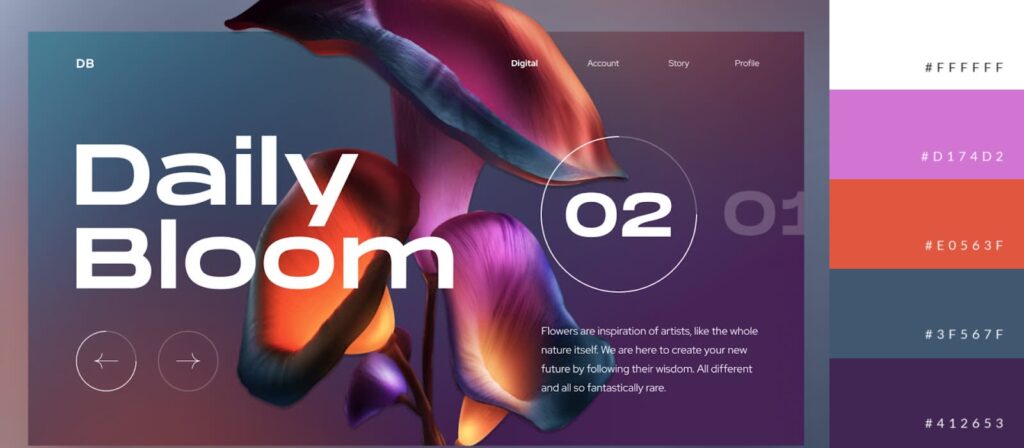
Strategic Applications of the Pinterest 2025 Color Palette
As experts in branding and web development, Nuance Digital Dynamics goes beyond aesthetics. We leverage colors to:
- Influence emotion and engagement
- Improve readability and conversions
- Create seamless user journeys across devices
Whether you’re running a service-based business, a product store, or a nonprofit, applying the Pinterest 2025 color palette with intention can lead to measurable results.
Here’s how we help you implement these shades strategically:
- Color-matching with brand identity kits
- A/B testing button shades and hover states
- Choosing complementary typography for color balance
- Accessibility audits to ensure all users can engage with your palette
Color choice is not just art—it’s strategy.
Why Color Trends Matter in Web Design
Following color trends like those in the Pinterest 2025 color palette does more than make your site look current—it signals innovation, awareness, and brand adaptability. Your site becomes a dynamic part of a larger cultural conversation.
Plus, users tend to trust brands that visually align with current aesthetics. A fresh, well-executed palette communicates that you’re paying attention—to trends, to users, and to detail.
Final Thoughts: Make 2025 Your Most Colorful Year Yet
At Nuance Digital Dynamics, we believe that thoughtful design creates powerful experiences. The Pinterest 2025 color palette gives brands a beautiful opportunity to refresh their visuals, connect with their audience, and make lasting impressions.
From bold accents to soft neutrals, each shade tells a story. And when applied with care, these colors can support accessibility, drive engagement, and reflect your brand’s evolution.
Whether you’re ready to launch something new or revitalize an existing site, our team is here to bring your vision to life—one pixel, one color, one brilliant idea at a time.
? Ready to get started? Contact Nuance Digital Dynamics today, and let’s craft a custom web design that turns heads and drives clicks.
? Visit us at NuanceDigitalDynamics.com
